


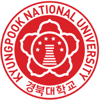
Symbol Mark
To effectively express KNU’s authority, long-held educational spirit,as well as its future-oriented mindset embracing the global era, an Authority Mark that maintains the existing KNU emblem and a new Communication Logo Mark are dually used.

Authority Mark
The Authority Mark is a basic UI of KNU and features several core elements. Originally selected through an open contest and modernized in 1999, the emblem consists of the Cheomseongdae in the center (an observatory representing the essenceof the Shilla dynasty and culture),capped by 6 stars representing the original 5 colleges and 1 graduate school which started KNU. The circle around the Cheomseongdae represents the all-round character, pride, and harmony of the KNU community.

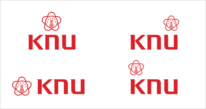
Communication Logo Mark
The Communication Logo Mark symbolically represents KNU’s global mindset. Through the English initials of KYUNGPOOK NATIONAL UNIVERSITY, the upright, intellectual, and modern image of KNU as an institution of higher educationis expressed.
Symbol Mark Color
The designated and supplementary color is an important aspect in forming image along with sympol mark. White is background color when using designated and supplementary color. In usage of designated color, spot color is base color and exact color, brightness and chroma must be kept. Designated color supplementary color
Main color
KNU RED
C10, M100, Y100, K0
PANTONE DS87-1C
KNU GRAY
C5, M5, Y7, K50
PANTONE DS325-1C
Sub color
C0, M35, Y80, K25
PANTONE
877C
C0, M0, Y0, K20
PANTONE
873C
C35, M0, Y10, K15
PANTONE
DS248-7C
C25, M25, Y0, K10
PANTONE
DS194-9C
C20, M15, Y35, K10
PANTONE
DS13-6C
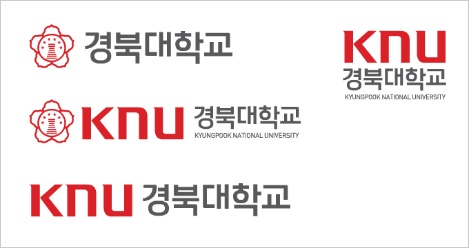
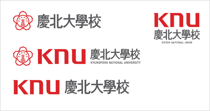
Logo Type
A special font type was developed for the KNU logo in order to differentiate the University from other institutions. The logo-type can be incorporated into other documents and graphic designs representing KNU, or used independently as a stand-alone representation of KNU. The KNU logo type is available in Korean, English, and Chinese.
Korean horizontal type
Chinese/English horizontal type
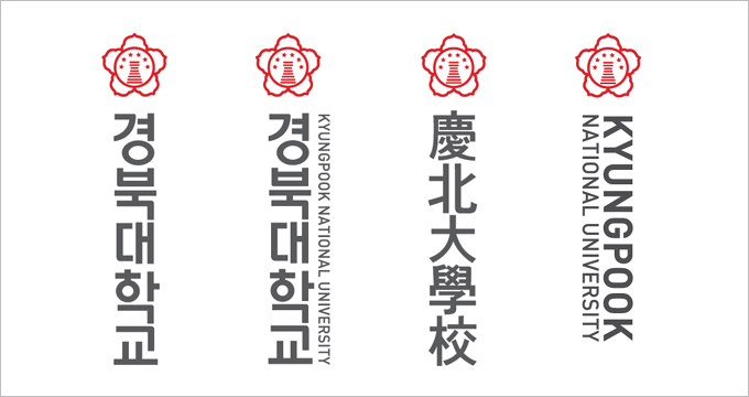
Korean/Chinese/English vertical type
Emblem
The KNU Emblem is an important design element of KNU, developed based on the KNU symbol mark. It is used for key media outlets and publications. When expressed in the designated color, the background color is grey-tone, and should be used with a 0~20%, 80~100% brightness range; or 0~20% when the background is colored.

Signature
The design elements of the symbol mark and logo type are mixed in ideal portions. It is principle to use digital data for precise usageWhen using the signature logo type, the letter color should be C0,M0,Y0,K80
Signature in English
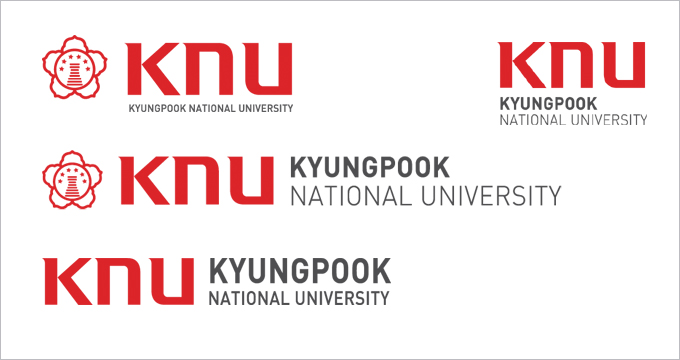
Signature in Chinese
Vertical Signature
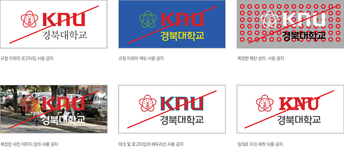
Regulationsregarding usage of signature block.
Font Type
The font type should be consistent in all application systems to maintain a consistent KNU brand image. The names of departments in main administration, colleges, departments, and supporting departments must use font type Yoongothic540for Korean and DIN-Regular(영문) for English


Sangju Campus
A special font type has been developed for the KNU logo to differentiateit from that of other universities. While using the font type with the logo mark is advised,it can be used independently as well. The KNU logo type is available in.

Logo Type

Signature
